Splitting a Gatsby site into communicative reusable components
Table of contents
- Introduction
- Perquisites
- Sorry no jQuery
- Install styled components
- Import React based libraries
- Create the minimized Hamburger button with styled components
- Create the menu links in our hamburger button
- Declaring and exporting styled components in our sidebar
- Create the menu links
- The completed code
- How to use the completed code
Photo of a Snuffbox by Factory director Claudius Innocentius Du Paquier period from The Met Museum
Introduction
In the previous blog we learned how to convert a website from HTML with css to Gatsby. The only thing we didn’t do was render the Sidebar and the logo.
- In this tutorial you will recreate the sidebar in Gatsby and isolate it into a separate styled-component complete with it’s own css styles.
- Learn to share data between components.
- You will see how great React styled-components are for UI design as they are lowly coupled and highly cohesive. Making them more reusable.
- Why should you bother? Well you will be creating your own UI components which you could put online for other people to use such as people in your own project team.
Imagine if you had a gaming console with controllers hardwired to it. Wouldn’t it be cool if you could have them as a separate wireless component to the console just like with a TV remote control?
Even better what if you could reuse the same wireless gaming controllers for other consoles like at your friends place? That’s the great thing with components. We can make the sidebar more portable.
Perquisites
- You should already know how to compile Gatsby. If you do not then please see my previous blog
- You should know about CSS especially the difference between internal and external style sheets.
- You should know about HTML DOM.
Sorry no jQuery
jQuery does not know of Gatsby’s existence so it can cause conflicts as jQuery manipulates the DOM directly while Gatsby is more loosely coupled. We have to reinvent the wheel with the “sidebar” element as it was written with jQuery. Besides we can use it again later.
I cannot take full credit for how to create the sidebar. Only how to abstract it. I learned the styling from this awesome video by Chris DeSilva. Please advise I made some tweaks to it.
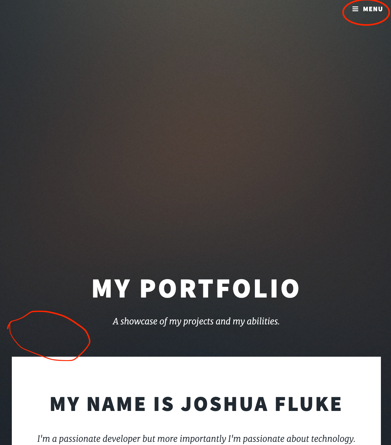
When we open the red encircled hamburger icon we want the sidebar to appear with the headings on the page so we can go back to other pages.
We may want that to appear as well in the white section at the top if the screen is not minimized which I may do in later blogs. You can’t see the white space where I have encircled it red but if you were to fully maximize the web page, you would see it.
Install styled components
Install styled components using this command in your local console
npm install gatsby-plugin-styled-components styled-components babel-plugin-styled-components
After that we need to tell our project to explicitly use it in our gatsby-config.js file. If it is not there, you just need to create it in the root of your Gatsby site folder.
module.exports = {
    plugins: [`gatsby-plugin-styled-components`],
}
Import React based libraries
We are going to create an external styled component outside our index.js file.
Create a file in the components folder. Call it sidebar.js and add this to your imports list.
import styled from "styled-components"
import React, { useState } from "react"
import { Link } from "gatsby"
If you watched that video before, please note we will not use global styles in order to keep the component portable and minimize any side affects with global styles.
Create the minimized Hamburger button with styled components
Now we create the style component Hamburger button. We will call it MenuIcon.
const MenuIcon = styled.button`
  position: fixed;
  top: 2rem;
  right: 2rem;
  display: flex;
  flex-direction: column;
  justify-content: space-around;
  width: 1.5rem;
  height: 1.5rem;
  background: transparent;
  border: none;
  cursor: pointer;
z-index: 999;

  div {
    width: 1.5rem;
    height: 0.2rem;
    background: white;
    border-radius: 5px;
    transform-origin: 1px;
    position: relative;
    transition: opacity 300ms, transform 300ms;

    :first-child{
      transform: ${({nav}) => (nav ? 'rotate(45deg)': 'rotate(0)')}
    }

    :nth-child(2){
      opacity: ${({nav}) => (nav ? "0" : "1")}
    }

    :nth-child(3){
      transform: ${({nav}) => (nav ? 'rotate(-45deg)': 'rotate(0)')}
    }
  }
`
We are fixing it to the page regardless of where user scrolls with the position property set to fixed.
Keep in mind inside the MenuIcon element we are setting the z-index value at 999 so when the sidebar is toggled open, the hamburger icon will wrap over it so we can close it.
In the div ID we first create the look and feel of it and are nesting 3 bar sub icons to create the hamburger button which is first-child, nth-child(2) and nth-child(3).
The first-child pseudo-class selector is creating the first bar while nth-child(2) and nth-child(3) are the 2nd and third hamburger bars of the icon.
The transform property is holding instructions for the bars to turn into an x shape upon the user clicking it.
Create the menu links in our hamburger button
This contains the look and feel of the menu display when we click on the hamburger icon.
const Menulinks = styled.nav`
  display: flex;
  flex-direction: column;
  justify-content: center;
  text-align: center;
  height: 100vh;
  width: 25%;
  position: fixed;
  transition: 300ms;
  background-color: black;
  top: 0;
  right: 0;
  z-index: 998;
  transform: ${({ nav }) => (nav ? "translateX(0)" : "translateX(100%)")};

  ul{
    list-style-type: none;
  }

  li{
    margin-top: 1rem
  }

   a{
     text-decoration: none;
     color: white;
     font-size: 1.5rem;
     transition: color 300ms;
   }

  :hover {
    color: #6ab4ff
  }
`
Important thing to note is we are keeping the position of the menu fixed. Else it will not stay fixed to the viewport (i.e what’s on screen) when the user scrolls up and down. Also set the value of z-index to 998 so it can wrap over any other elements on the page.
We have now finished the initial style of the styled components. Now we have to declare and export them.
Declaring and exporting styled components in our sidebar
In your component please add the following.
export const Sidebar =  () => {
  const [nav, showNav] = useState(false);
return(
...
We will now declare the useState hook. We use the hook which provides a session state variable to retain the data bettween renders.
What that means is when we toggle the sidebar on and off, the content shown on that sidebar will be re-rendered with an inbuilt state setter function from the hook. That function will tell React to render the component again.
This is the code that will allow us to toggle the sidebar. As it is a styled component all you need to know is we get to nest 3 div bars inside it to display the hamburger button.
...
    <>
      <MenuIcon nav={nav} onClick={() => showNav(!nav)}>
        <div />
        <div />
        <div />
      </MenuIcon>
...
When you run gatsby develop you should see the component appear on the webpage. There should be a hamburger icon on the very top right. It’s very important the sidebar remains fixed to the page as you can put a table of contents on it down the track. I will not be doing that however for these tutorials.
Create the menu links
It’s time to personalize the component. We are in the final process of declaring our component structure.
      <Menulinks nav={nav}>
        <ul>
          <Link to="#">Blog</Link>
        </ul>
        <ul>
          <Link to="#">home</Link>
        </ul>
        <h3>Social</h3>
        <ul className="icons alt">
          <li>
            <Link to="https://github.com/LayersOfAbstraction/layersofabstraction.github.io/" className="icon fa-github">
              <span className="label">GitHub</span>
            </Link>
          </li>
          <li>
            <Link to="https://www.linkedin.com/in/jordan-nash-87b042173/" className="icon fa-linkedin">
              <span className="label">LinkedIn</span>
            </Link>
          </li>
        </ul>
      </Menulinks>
    </>
  );
}
For the menu links we want them to all load straight away in the viewport hence the “Link to” tags. We also used the Font Awesome tags to load the icons for Github and LinkedIn. That will complete the code. This is what it all looks like
The completed code
import styled from "styled-components"
import React, { useState } from "react"
import { Link } from "gatsby"

const MenuIcon = styled.button`
  position: fixed;
  top: 2rem;
  right: 2rem;
  display: flex;
  flex-direction: column;
  justify-content: space-around;
  width: 1.5rem;
  height: 1.5rem;
  background: transparent;
  border: none;
  cursor: pointer;
  z-index: 999;

  div {
    width: 1.5rem;
    height: 0.2rem;
    background: white;
    border-radius: 5px;
    transform-origin: 1px;
    position: relative;
    transition: opacity 300ms, transform 300ms;

    :first-child{
      transform: ${({ nav }) => (nav ? 'rotate(45deg)' : 'rotate(0)')}
    }


    :nth-child(2){
      opacity: ${({ nav }) => (nav ? "0" : "1")}
    }

    :nth-child(3){
      transform: ${({ nav }) => (nav ? 'rotate(-45deg)' : 'rotate(0)')}
    }
  }
`

const Menulinks = styled.nav`
  display: flex;
  flex-direction: column;
  justify-content: center;
  text-align: center;
  height: 100vh;
  width: 25%;
  position: fixed;
  transition: 300ms;
  background-color: black;
  top: 0;
  right: 0;
  z-index: 998;
  transform: ${({ nav }) => (nav ? "translateX(0)" : "translateX(100%)")};

  ul{
    list-style-type: none;
  }

  li{
    margin-top: 1rem
  }


   a{
     text-decoration: none;
     color: white;
     font-size: 1.5rem;
     transition: color 300ms;
   }

  :hover {
    color: #6ab4ff
  }
`

export const Sidebar = () => {
  const [nav, showNav] = useState(false);
  return (
    <>
      <MenuIcon nav={nav} onClick={() => showNav(!nav)}>
        <div />
        <div />
        <div />
      </MenuIcon>
      <Menulinks nav={nav}>
        <ul>
          <Link to="#">Blog</Link>
        </ul>
        <ul>
          <Link to="#">home</Link>
        </ul>
        <h3>Social</h3>
        <ul className="icons alt">
          <li>
            <Link to="https://github.com/LayersOfAbstraction/layersofabstraction.github.io/" className="icon fa-github">
              <span className="label">GitHub</span>
            </Link>
          </li>
          <li>
            <Link to="https://www.linkedin.com/in/jordan-nash-87b042173/" className="icon fa-linkedin">
              <span className="label">LinkedIn</span>
            </Link>
          </li>
        </ul>
      </Menulinks>
    </>
  );
}
How to use the completed code
Simply import the component into your home page like this.
import { Sidebar } from "../components/sidebar"
And declare this inside your page component, inside a wrapper tag for example.
<Sidebar />